
A Case Study
About
The project is a user-centered design thinking process and includes UX and UI design. The project was completed during my UX/UI bootcamp at ironhack in Berlin. The question was how we can help museums and other public institutions fulfill their mission of preserving cultural heritage in the 21st century.
The Task
Schedule of 10 days
Focus on Minimum Viable Product (MVP)
Limitation to only one mobile or tablet device
Team
Individual Project
My Role
UX/UI Design
Timeline
2 weeks, April 2022
Tools
Pen & Paper, Figma
THE MAIN PROBLEM
Low attendance is the main problem of museums and other public institutions.
In today's world, museums compete with many other activities and entertainment options for people's limited attention. There are a variety of events, films, concerts and other arts, culture and leisure activities competing for people's time and interest.
SOLUTION
1. Give users more control over their time and money
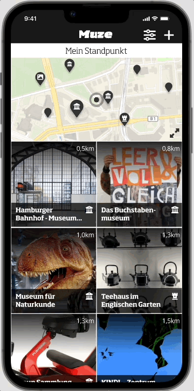
Users should be able to set the location type, price and distance to get relevant recommendations. For the app to deliver the best search results experience, it is recommended to allow GEO tracking.
Fig. 1. App intro screens - pre-load “Whizzard”
2. Allow easy access for everyone and everywhere
To be able to compare the offers in the best possible way, the most important factors should be presented in a good text-image ratio. A map shows the user's current “location” and surrounding events.
Fig. 2. App home screen - search results and filter settings
3. Create a platform for innovation and deeper engagement
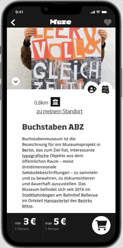
As a basis, events/ locations can be saved for later because now might not be the right time. And as a special feature, a third-party solution to experience museums around the world in 3D.
Fig. 3. App user interactions - favourites list and Google Street View access.
Process & Approach
DAY 1 - UNDERSTANDING THE PROBLEM
I was able to reach 24 participants from a worldwide network, and was interested in their motivations for attending cultural events and how they pass on their experiences. Also what reasons there are for not attending one or another event. And to find out how individual users remember a particular event (so that it doesn't get lost), I later surveyed another 5 people.


The Challenges
demographic change
accessibility and inclusion
new formats of mediation
cultural participation
censorship efforts
Fig. 4. Desktop Research
The Users
individual visitors
visitors with impairments
children and school classes
senior visitors
visitors with history of immigration
Fig. 5. User Research
Top 5 reasons why people don't go to museums
-
The cost of admission to a museum can be prohibitive for some people.
62,5% of the survey
-
Some people do not have the time to visit a museum due to other commitments.
-
The location of a museum is too far away for people to visit.
25% of the survey
-
Some people are not interested in the type of exhibits a museum has to offer.
-
Museums may not be accessible to people with disabilities or other special needs.
DAY 2 - DEFINITION
Interested users are mostly confronted with the facts:
that the admission price is too high (62.5%)
the distance is simply too far (25%)
Both have direct impact on their costs !!!
Assumption
If users can decide for themselves which recommendations they want to receive ++ And the application manages to combine both, the enjoyment of art and the entertainment value — in combination with the community aspect (beside an attractive presentation of the offers), the user experience can be increased to such an extent that a visit is more likely to take place.
Fig. 6. User Persona 1/5
Fig. 7. User Journey
-
It seems like a common behavior that 37,5% of my individual users in the age of 25-35 are motivated by the exchange with friends and family either before, during or after visiting a cultural event or institution. Fun fact: About 12% just want to entertain their (young & old) relatives.
-
It can be assumed that there would have to be two types of access. One for end consumers who want to search and experience art and culture, and one for organizers/ publishers who want to offer art and culture. The latter can be created in a local/ regional live test (also by users). However, it will be very difficult to cover an entire nation (let alone internationally) with up-to-date event/ location information without additional work.
-
Price and ticket information is as colorful as the arts themselves. Different tariffs in combination with special conditions represent a major hurdle. This means that payment information and/or reservation/ time quotas, image licenses and information about the event itself should be ensured in some form so that a conversion/lead takes place at all.

DAY 3 - EXPLORING IDEAS AND SOLUTIONS
“How might we..” make our users have more fun using the app?
I concentrated on putting as many ideas as possible on paper and then relating them to the goals to be achieved by estimating them in terms of effort and benefit.
Fig. 8. How-Might-We Poster
Design Challenge
1. Easy access for everyone and everywhere
2. Giving users more control over their time and money
3. A platform for innovation and deeper engagement
In addition to the brand and its message, the focus for me is on a practical application that does not interrupt the user flow and, if possible, offers positive surprises. Once I was able to estimate the rough scope of my application, I wanted to test initial ideas and content types for each of my touchpoints.
Fig. 9. Journey Map

DAY 4 & 5 - EARLY CONCEPT TESTING
With the following 4 use cases it should at least be possible to use the Minimum Viable Product (MVP) in its basic function. The tasks are pretty much what I discovered in my design thinking process. At the same time, they are the basis for my user tests, for example in form of tasks to ensure usability.
Fig. 10. User Stories for MVP
It is advisable to think about the number of pages, their value and the information structure behind them. Therefore, I have created a manageable flowchart to show the main user flow based on the user's tasks, also known as jobs-to-be-done (JTBD), and combine it with my core functions.
Fig. 11. Sitemap - Iteration 1
Fig. 12. Process Flow Chart - Iteration 1 & 2
Using different visualisations for each of my touchpoints by drawing rough sketches (Cracy8), it turned out that for the welcome page/ recommendation list (my home screen), users preferred the version where an interactive map is displayed directly above the list items.
Fig. 13. Sketches (Cracy-8)
So I could identify and resolve potential problems early on:
Which information provides the quickest overview for the user?
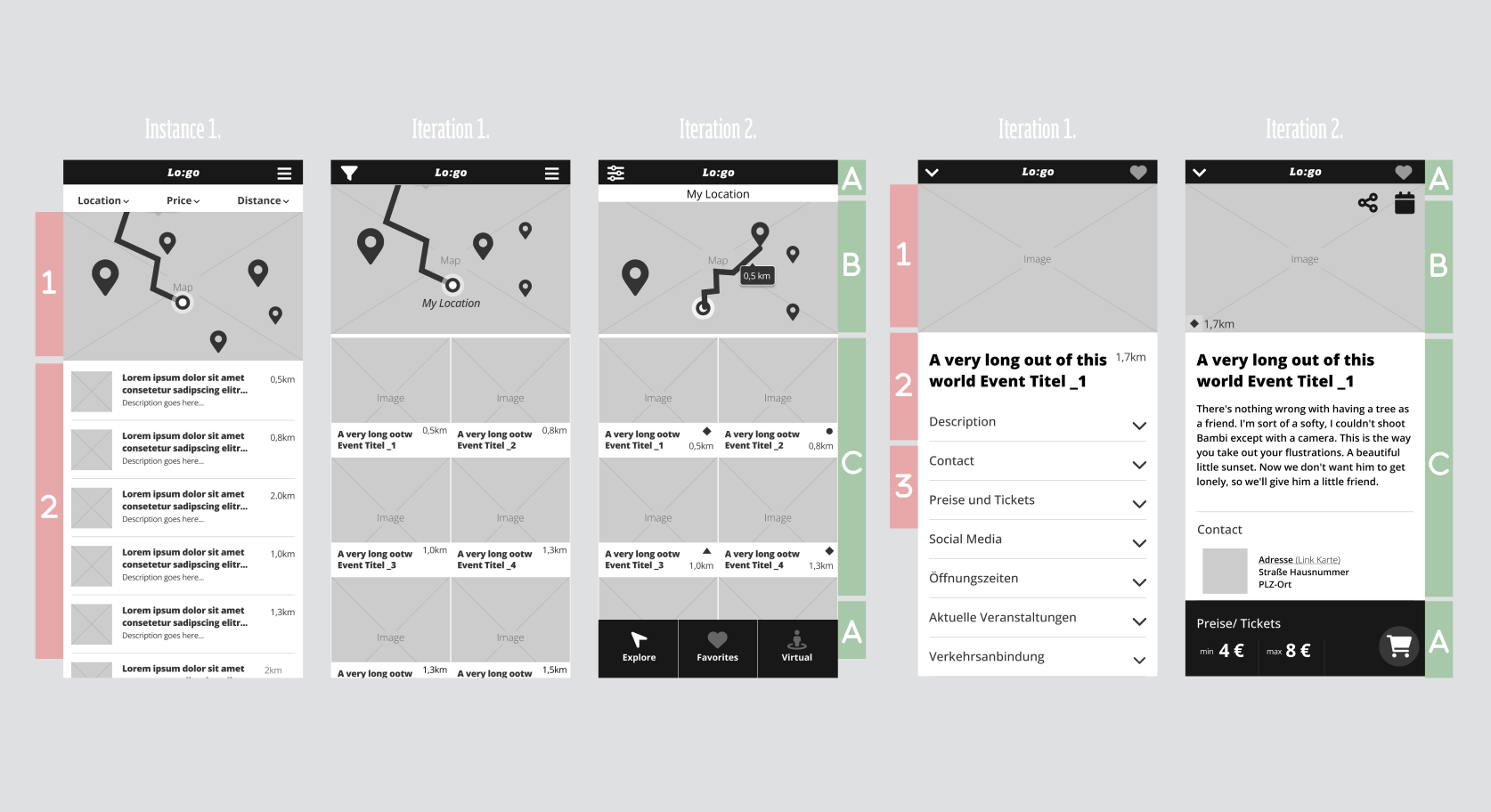
Fig. 14. Prototype, program element homepage/recommendation list
-
With test users, I was able to quickly learn the following things:
Presetting location, price and distance (filter) right after app launch on a single page didn't work well. Users needed much time to set their preferences or figure out what to do.
With different layouts for text and image elements on the home/ welcome screen, I was able to test which presentation gives the user the best overview effect when browsing several events.
And what information is needed on the event detail/ location page.
WEEK 2 - UI-DESIGN
Before I started to developed a visual design language, I wanted to do a quick recap of my focus groups that I started in the second step of the UX design process (Empathize). It helped me put myself in the average user's mindset.
Three main questions influenced my design strategy
How do I design for erveryone?
What context do I need to consider?
What is the perfect experience?
Fig. 15. Low-Fi Persona Matrix
Fig. 16. Prototype layout grid for iPhone 13 (IOS15)
-
As long as we first want to test the market readiness with our users using the MVP, we are in a conception phase. Therefore, I would like to approach the Apple platform first with the high-fidelity prototype and map it in detail using the iPhone 13 (iOS15) as an example, which brings with it some visual peculiarities and must be taken into account in the basic grid and layout structure.
-
Naming a brand is a little difficult matter for me. This makes the structure of the following table, based on Josh Levine's model, all the more useful. The categories are common characteristics that logos usually correspond to. Those marked in bold are my personal favourites, as they best fit the product characteristics and brand strategy.
Fig. 17. Search for brand name based on Josh Levine's model
Design direction 1
focuses on the attributes:
guided, entertainment, adventurous and explorationBy using the brand attributes:
energetic, bold and stable

THE STYLESCAPE
The Stylescape follows a stable, yet energetic brand strategy. Combined with artistic imagery, it is intended to communicate the cultural offers in the form of news as an entertainment event and invite users to explore the diverse offerings available in their local regions.
The monochromatic theme in the initial iteration of my MVP ensures optimal contrast, prioritizing accessibility for users with visual impairments.

Let yourself be inspired and discover the cultural landscape in your area.
With MUZE, your cultural journey is as easy as swiping on your smartphone.
MUZE is an invitation to discover and experience the fascinating art and cultural landscape of the users region — whether exciting museums and exhibitions, the most hidden treasures, varied theaters and selected museums from around the world.
City holidays have never been so0O easy!

TESTING
Iteration-I of my minimum viable product (MVP), prototype is optimized for iPhone 13 (IOS15) as an native application.
Presetting (Intro)
Explore (Home)
Location Details (Actions)
ARTEFACTS
Project: Muze_
-
01 Empathize
Desk Research
Survey & Interviews
Empathy Map
Affinity Map
02 Define
Problem Statement
Hypothesis
User Persona
User Journey
03 Ideate
HMW
Mindmap
Project Goals
Feature Matrix
Journey Map
Competitor Analysis
04 Prototype
Sketches (low-fi)
User Stories
Sitemap (information architecture)
Process Flow Chart (Iteration I)
Wireframe (mid-fi)
Usability tests
05 Design (UI)
Competitor Analysis
Persona Matrix (low-fi)
Hate-and-Love List
Brand Attributes
Brand Naming Styles
Moodboard
Stylescapes
Prototype (high-fi)
Style tiles
06 Testing
Contextual Interviews
Feedback
CONCLUSION + LESSONS LEARNED
-
Involve all user groups in the UX process early in order to identify useful features.
Defining the MVP is helpful to better estimate and manage time and effort.
Check Figma plugins, e.g. to ensure accessibility according to WCAG guidelines right from the start.
-
The identification of KPIs as an initial data basis for making project success measurable.
Testing with all user groups ensures accessibility for all, including individual limitations.
Exploring the community aspect with users can provide insights to identify social interactions.
Advanced map-navigation functions for intuitive operation and optimized user experience.