

About
The new yoga studio “Auszeit” www.auszeit.studio is located in the rural region of Rochlitz (Central Saxony), which aims to create a calm and relaxed atmosphere where customers can improve their physical and mental health. The project objective was to create a strong brand identity and an effective website that not only raises the profile of the studio locally, but also positions it as a safe space and retreat in the region.
Tasks
Research, Analysis
Concept and Idea
Brand Strategy
Webdesign/ Testing
SEO Analysis
Team
Privat side project
Role
UX/UI Design, Development
Timeline
4 Month, April 2023
Tools
Pen & Paper, Figma, Mindmap
1. market analysis and user behaviourCompetition and demand, a regional overview of the yoga market
The yoga studio market in the region is small, in addition to one studio in Rochlitz, there are nine private yoga trainers/ instructors (with web presence) in the area.
Source: Listflix.de - Company database
A keyword research confirmed a demand for yoga classes in the region. The market analysis revealed that competitors primarily advertise yoga as a fitness and lifestyle offering, while the holistic experience is often neglected.
-
Rising costs
Free offers on social media
Increased competition
Growth of aggregators
Few good teachers/ trainers
Read the full process on → my blog
Desk research
The target group in numbers, who are the users and regional customers?
Studies show that yoga is less common in rural areas (7% of yoga practitioners) than in cities (17%). And of those who practice yoga, most actually practice at home (86%), while only ≈20% visit a yoga studio.
Yoga students/ customer
The studio's target group is primarily women (90%) between 18 and 50 years who value health, well-being and personal development. The focus group has a busy work schedule and actively seeks a balance.
Yoga trainers/ partner
Private yoga or similar health services that already offer the service on a freelance basis and are looking for suitable facilities for larger, regular group classes.
Target group: Focus group: Women 31-45+
Location: Older audience (⌀48,6), increasing demand
Channels: Online: Google, YouTube, social media
Behaviour: Older yogi*nis spend more per capita
Motivation: Health, fitness, injury prevention
-
Women make 90% of all yoga bookings, men 10%
58% of yoga bookings (eversport) are made by women over 40
50% of yoga bookings (eversport) are made by women between 31-45
Rochlitz has a high average age of 48.6 ↑ tendency
Google, YouTube are the leading apps for searching offers
Older yogis spend more per capita per year on yoga classes
70% prefer Instagram, YouTube and Facebook for yoga content
Yoga is popular with fitness, crossfit and dance enthusiasts
86% practise yoga at home, 20% in a studio
10% start yoga because of an injury


With the help of these user personas, we are able to incorporate the needs of our target group into the studio's digital and physical service.


2. Concept and ideasThe idea of creating a digital authentic service for a diverse user group
Although yoga is becoming increasingly popular in urban areas, the offer in rural regions is limited. At the same time, it turns out that many potential customers prefer to train in their own living room. So the challenge is to convince all the “at-home online yogis” and all those hesitant or undecided people to visit a local studio.
Solution
To address people who are looking for an authentic yoga experience without having to travel in larger cities. The studio should differentiate itself through a strong emphasis on inner calm, community and competent support. It is important that students and trainers can build a personal connection to the studio and its values, as a sense of community and authenticity are key factors when choosing a yoga studio.
Design Challenge:
Find ways to get “at-home online yogis” into the studio
Create an aura that emphasizes community & expert advice
Develop a design that is particularly attractive to regional users
Integrate elements that enhance encounters and mindfulness
-
How do we set the studio apart from other wellness offerings?
How do we design age-appropriate for middle agers and seniors?
How do we create a calm and relaxed atmosphere?
How do we encourage dialogue and creativity?
How do we optimise bookings for students and trainers?
3. identity and brandingBuilding a brand with personality, an identity with recognition
The brand development focused on working closely with stakeholders to find out how we can emphasise the uniqueness of the studio as a place to slow down and heal, and how we can strengthen the trust of the target group in the holistic effect of the offer.
Popular Auszeit-Logos in context of yoga that show a design that I would prefer to avoid.
-
The name “Studio Auszeit” immediately conveys the idea of a break from everyday life and an inner time-out. As “Auszeit” and “Studio” are popular keywords in the market (Vol. 110 / SD 19), it is more challenging to achieve a good placement. The short and concise URL www.auszeit.studio (Top-Level-Domain) is simple and easy to remember, which not only makes a clear statement about the offer, but is especially relevant in terms of SEO.
-
In the regional competition, there are studios that mainly offer fitness-orientated services. Studio Auszeit clearly positions itself differently, as a spiritual retreat that promises a deeper, transformative experience and aims to set itself apart with a personalised atmosphere and individual support, with a focus on a sense of community.
Read the full process on → my blog
What stakeholders and customers think of the brand
The aim was, before we even used anything visual, to find out from stakeholders and their potential customers what they associate with a “time out” (Auszeit), what characteristics the company should have and what personality they would ascribe to the product or service.
Features highlighted:
Inspires people
Neutral, pastel and warm
Connects people
Collaboration
Relieved
Brand-Personality-Quiz – Characteristics that stakeholders emphasized: calm, creative, intuitive, relaxed, and confident
The survey shows that calmness, naturalness, individuality, expertise and warmth are important brand attributes for users. These attributes were integrated/ defined into the final design elements.
Survey – Brand Attributes – Characteristics that users emphasized: calm, inspiring, hearty and individual

Visual leitmotifs: colors and moods that convey calm and harmony
The moodboard includes natural elements such as earth, wood, plants and water, symbolising nature and peace. Soft colors such as green and beige aim to convey a sense of calm and harmony. In contrast, peach/ grapefruit or skin-colored tones evoke associations with people and other organic forms.
The choice of images and motifs emphasises wide/ open spaces, nature and relaxation. These characteristics formed the basis for the design of the logo and the website. People are the main motif for the sense of community.


1st Round – character and ideas: In order to find a suitable style, I quickly tried out various ideas (for many) based on the results of the quiz and eliminated them using the downsampling principle. The aim was to show stakeholders how different the first impression can be and test the reactions.
The values of “calm”, “balance” and “transformation” formed the core of the branding. These elements were to be reflected in both the visual identity and the communication.
2nd Round – variants: to fully realise the potential of the idea, I developed different variants of the same design after a first selection round. To help the stakeholder visualise the results better, I had to present the designs as mockups.
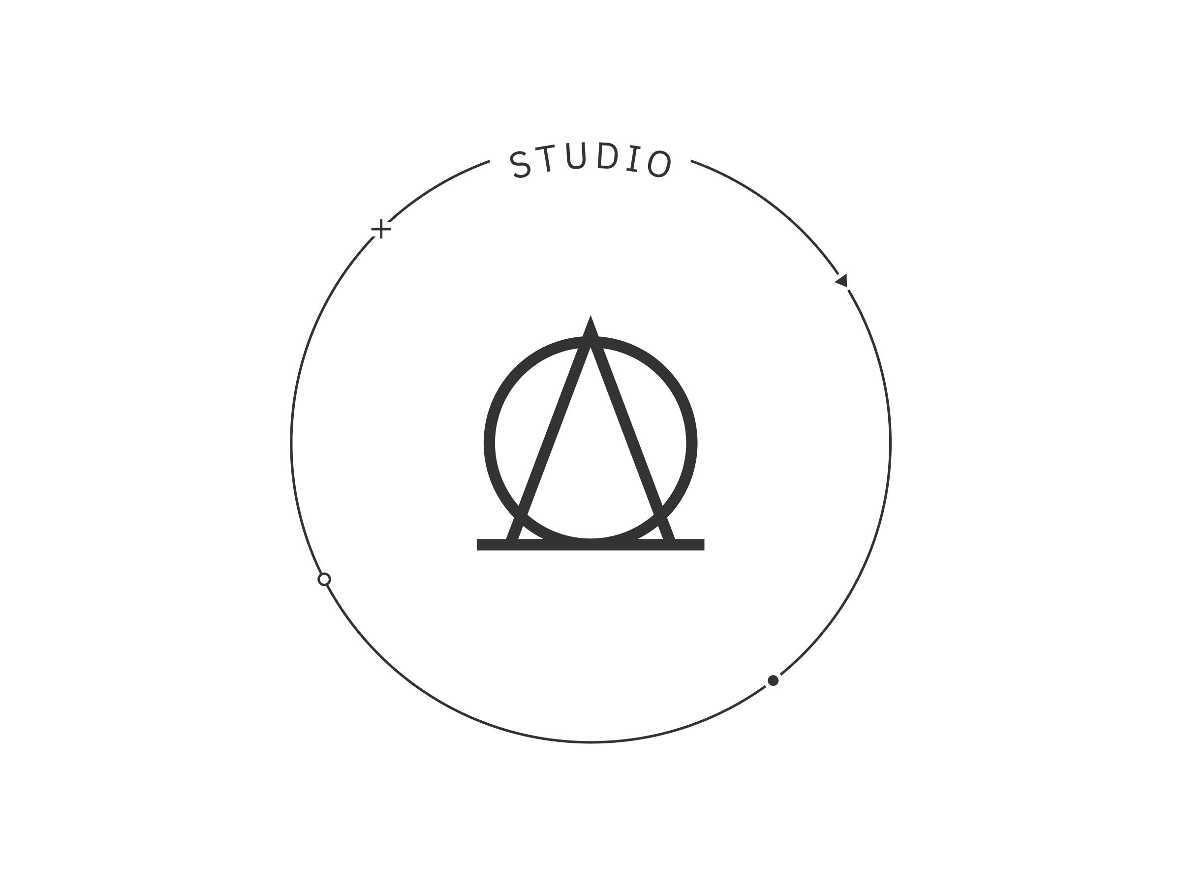
The logo, a symbol of purity and new beginnings in timeless simplicity
To emphasise calm and balance, the word mark is kept simple and clear. To convey accessibility, the font is modern and easy to read. The figurative mark consists of a simple circle, complemented by a “lazy A” (as I call it), whose relaxed, downwardly shifted centre axis forms a triangle.
The final logo and its variants for different purposes.
Both together, a minimalist circle symbolising both the flow of yoga & infinity, in combination with a triangle transforming into a ligature, were used as the central symbol and logo – a symbol of purity and new beginnings.


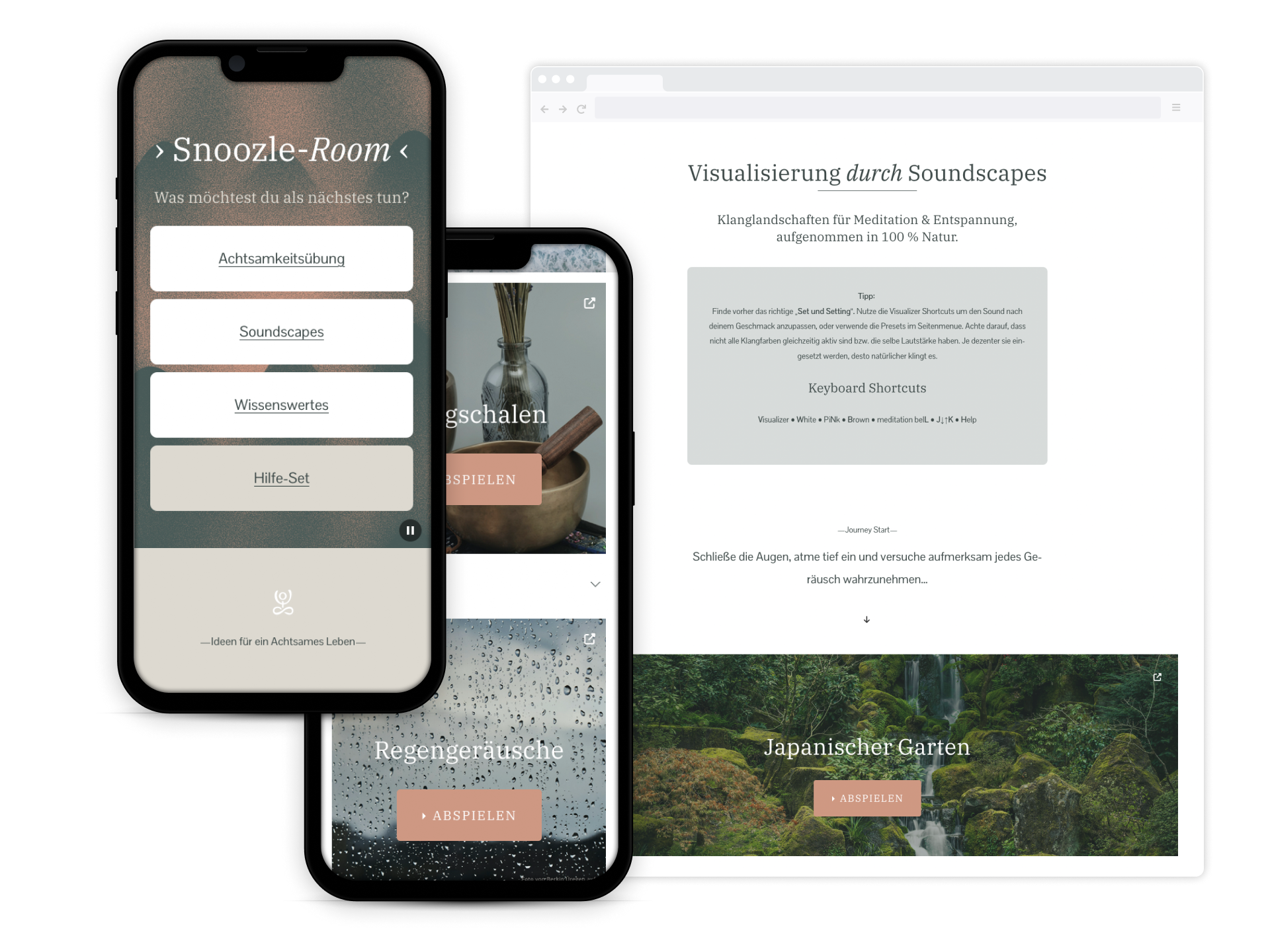
4. WebdesignA digital experience that combines holistic well-being and curiosity
-
The color palette is based on the natural tones of the mood board - a soft green and warm earth tones. These colors were chosen to emphasise the calming and healing atmosphere of the studio while creating a connection between people and nature.
The studio's webdesign embodies the philosophy of calm, community and holistic health. Natural elements create an inviting, relaxed atmosphere while emphasising the studio's expertise.
The design is specifically tailored to an older target audience and conveys an authentic image of the studio.
—without being too spiritual—
-
![]()
1. Positioning as a specialist: Emphasising the values
The aim was to publicise the studio as a unique place. The positioning is strengthened through strategically placed keywords and an market-relevant blog. The logo is prominently displayed on the website and in public places to promote recognition.
-
![]()
2. Oasis of calm: Design for maximum relaxation
The aim was to create an ambience that invites relaxation. A calming color palette and familiar imagery create a harmonious ambience. Clear messages and informative elements support a relaxed user experience.
-
![]()
3. Inclusive design: Appealing to all generations
The aim was to make the website attractive to a broad user group. Intuitive navigation and easy-to-understand content for newcomers and the undecided. The emphasis on health aspects and masculine imagery make the studio accessible to all user and age groups.
-
![]()
4. Strengthening community: Inviting active participation
The aim was to create a place for people to meet and socialise. Introducing the team and their mission promotes closeness and trust. Teasers for trainer/ partner acquisition and insights into the studio strengthen the sense of community and the bond with customers.
-
![]()
5. All-in-one solution: Effortless booking of classes
The aim was to make the booking process as simple as possible. The flexible management solution makes organisation easier for trainers and offers students a smooth booking process. Although the platform is not easy for trainers in the beginning, but it combines booking with full cost control.


5. TestingOptimization based on user feedback and systematic testing of the website
-

Optimization through User Feedback
Before the launch, I conducted a contextual survey with my peer group. The feedback on color schemes, readability, and navigation was largely positive. Web analytics and feedback showed potential for improvement in mobile workflows, especially when searching for courses. These findings were integrated into the content structure and user guidance.
-

SEO Strategy and Analysis
The SEO strategy focused on local visibility and improved rankings through content marketing, on-page and local SEO. A blog with relevant topics, keyword integration, a Google My Business profile, and an active social media presence helped generate organic traffic and strengthen local rankings. Read the full process → on my blog
-

Observation of User Behavior
The user behavior showed that trainers primarily communicate with their participants through their own channels, such as group chats and social media, while the website plays a secondary role. To make the offering more accessible, I developed a dedicated microsite – a landing page for trainers so they can share directly within their networks.
-

Content as a Local Anchor
Through market analyses, keyword research and regular user surveys via social media, we have identified relevant topics for the studio's target group. This allows authors to publish blog posts that improve the ranking and at the same time appeal to the target group emotionally, thereby increasing the studio's visibility.
-

Usability over pure Cost Control
Trainer feedback showed that the original booking system was too complicated. I then conducted a new benchmark and tested two other alternative providers. The choice fell on a more user-friendly solution with a more streamlined interface – despite the additional cost. Fewer management errors confirmed the correct decision.
-

Accessibility and Content Strategy
To further develop the offering, regular surveys are conducted with target groups. In addition, an integrated feedback form on the website provides valuable insights into user needs – a contribution to the further development of the content and the continuous adaptation of the website to actual user expectations.

SummaryIn times of increasing focus on physical and mental wellbeing, “Studio Auszeit” symbolises the need for a strong sense of community. Through the consistent implementation of the brand identity and user/ customer feedback, active social media marketing and local SEO, the studio was able to position itself as a yoga studio in the region. The clear differentiation through a place of calm, healing and inspiration as core values appealed directly to the target group.
This allowed “Studio Auszeit” to accelerate the website performance.
Within a year from o to:
3th place in the Google SERPs
400% more page impressions
800% more total clicks
134 times more customer enquiries
11 new customers on average per month
400% more trainer enquiries
92 online bookings, 64 recurring
Read the full process on → my blog
-
Creating a sitemap proved to be helpful in planning website concepts quick and efficiently.
The brand personality quiz can certainly also be combined well with various mood boards.
-
Content strategy: Identify relevant topics for target groups
Content elements: Tease direct offers and more product content
Conversions: Measure and optimise user journeys and touchpoints