
SCHOWCASE
About
“Meine Schule Digital” is a browser-based application for managing products and their clients in context of schools and school authorities. A cloud based and responsive web solution with an intuitive user interface was needed that aims to provide and secure central access to all services in order to facilitate easy administration. While my role was officially that of a media designer, I gradually expanded into UX-related tasks. This hands-on involvement made me realize the true impact of user-centered design on creating purposeful and effective digital products.
Role
Media designer/ self-made UX/UI
Project duration
2016-2022
Tools
Pen & Paper, Axure, Bootstrap, Adobe XD, BrowserStack, Github
Company
TIME for kids Informationstechnologien GmbH
-
As I am not very familiar with networks in schools, I first had to familiarise myself with the industry. So, in order to better understand the advantages of functional interfaces, I had to get to know the stakeholder users better, e.g. what tasks and goals even motivation they pursue.
Know your users, identify a focus group and understand their needs.
Target groups:
Students/ Parents
Teachers and Guests
Directors/ School Management
IT Administrators (focus group)
School Authorities
Fig. 1. Empathy Map
Based on a in-depth qualitative online-survey of around 500 users with target groups (excluding students/parents) of seven schools, it became clear that IT administrators in particular, some of whom are also ambitious teachers, require intuitive administrative processes and clear information structures for their respective IT management.
Fig. 2. Persona Matrix
The Problem
-
Users, especially IT administration and school management, struggled to access relevant information efficiently. Disconnected platforms, redundant data, and an inconsistent interfaces led to an increase of support requests and unnecessary administrative overhead.
-
The company's constantly growing sales and service channels have led to a fragmented ecosystem. Distributed platforms and duplicate structures and content have made internal coordination more difficult and hindered a uniform service experience, thus also affecting the company's brand identity.
The Goal
Minimize support requests through improved usability
Simplify administrative interface for easier collaboration and remote maintenance
Streamline internal processes through centralization
Strengthen brand identity with a consistent service experience
Develop new customer groups at communal and state level
-
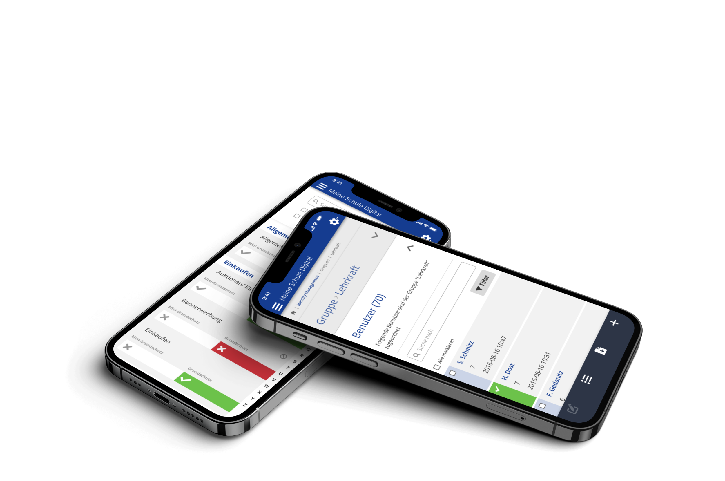
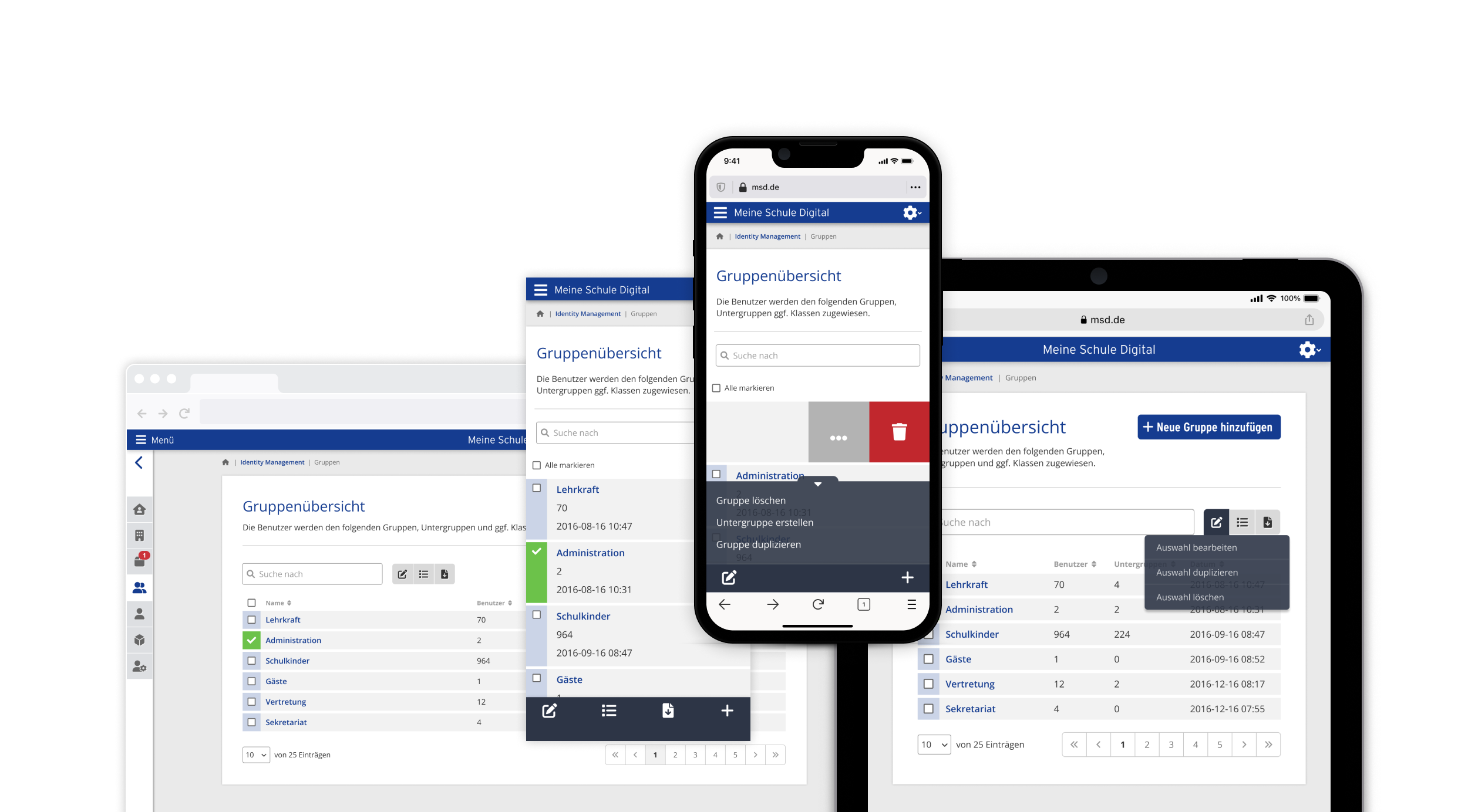
Operational and control elements are coherent and uniform for each device. For the operational business of a school network, I chose a dashboard that can represent all applications in the form of tiles and acts as a springboard to the respective application.
Ensure navigation and key information is accessible throughout the entire system.
-
On the sidelines of a presentation, I learned that students and teachers only see our software as a problem, as they mainly associate us with blocking websites. It was a nice opportunity to put our image in a positive light. Here you can see the still harmless version of some funny block pages that were necessary for technical reasons.

Remain flexible when finding a solution and incorporate every insight into the process.
-
Difficulties in using the software were identified through user feedback. To make the first steps easier, I chose a user onboarding for the basic functions, which allowed us to integrate them into the system at any point without much design effort.
Identify the goals of the respective user/role and take them on board.
-
To ensure a consistent corporate design across all channels, key design elements and the overall style guide were updated. A new company website landscape and business documents were created to communicate product features effectively to different target groups by simplifying complex information also for non-technical decision-makers.
A visual language can be followed across different touch points.
Fig. 3. Service and Marketing Handouts
-
In addition to designing functional interfaces, I was responsible for the structure, design, and integration of supporting content such as product information (web/ print), webinars and tutorials. The goal was to ensure seamless interaction between usability, support, and communication across all channels. Touchpoints such as support content, feedback forms (web/ print), newsletter/ email communication (CRM) and even error pages contributed to lowering digital barriers, sustainably facilitating platform usage, and positively influencing brand perception.


The result is a design that was unconventional for the industry and left a lasting impression.
The design concept of “Meine Schule Digital” proved to be effective, leading to its expansion across other products within the company's ecosystem and continuous improvements. By actively incorporating customer feedback and ideas throughout the entire development, a high level of acceptance was achieved.

-
During my time at the company, the agile Scrum organization was introduced based on the DevOps process circle. I helped set up the “design department” and defined new processes and included standardized test procedures, structured collaboration between design and development and a design system for better documentation and also visualization of research results.
Plan and develop in iterations, using rapid prototypes, validated tests and learn from the outcomes.
Fig. 4. Methods divided into 5 project phases

Strategy
The goal of the relaunch was to create a uniform visual appearance that communicates the brand and its products in a clear and friendly way. With the help of a clean design language that focuses on well-structured information, more trust should be created into the service and thus also in the technologies.
6 Month
The product was rolled out in its basic function within the planned time frame of 6 months and started with a large pilot project. Team: 1 designer, 1 front-end and 3 back-end developers, also 1 data engineer.
Challenges
The solution helped to acquire new customers (institutions) throughout Germany. Even so, long-term success was impacted by the company's technical dependencies, lack of standards, and limited resources on the client side in the SMEs, which made seamless integration difficult.
-
Strategic planning: A SWOT analysis and/ value proposition canvas can help identify risks and opportunities and enable proactive measures even before the project starts.
Prototyping for clarity: The creation of user flows and early wireframes made abstract ideas tangible and accelerated feedback loops and coordination with stakeholders.
Systematic UI thinking: The development of a component-based design system brought consistency, scalability, and speed – with prototyping in an iterative approach (occasionally only for presentations) itself becoming a status update in the project.
Workshop facilitation: Conducting design workshops with stakeholders and developers allowed us to build up a shared vision, identify constraints early and enable smoother collaboration.
Evaluating user experience: A System Usability Scale (SUS) and/ or Net Promoter Score (NPS) provides a lightweight and standardized method for measuring perceived usability and customer satisfaction to allows quick validation and prioritization.
Targeted communication: Product features only add value if target user is effectively informed, engaged and guided through their benefits while providing a coherent customer experience across the ecosystem.
-
Design refinement: The Product was designed for further iteration(s), evolving into a fluid design with helpful animations to improve engagement.
Focused role allocation: Specializing a clear design role is better than operating multiple areas (marketing, UX/UI, webdesign, administration) and enables a focused way of working.