About
The project is a design thinking process and involves more UX design than UI design as the design is already defined in the corporate design guidelines of the company. The project was completed during my UX/UI bootcamp at ironhack in Berlin. Blablacar is one of the world’s leading companies that takes its users from one place to another with the help of verified private individuals who offer the ride with their private cars, and that in more than 21 countries, so where is the problem?
All information in this case study is my own perspective and does not (necessarily) reflect the view of BlaBlaCar.
Team
Individual Project
Role
UX/UI Design
Timeline
4 Days, April 2022
Tools
Pen & Paper, Figma
The Challenge
Find the simplest and most elegant solution
Consideration of existing cooperate design
Other functionalities should not be affected
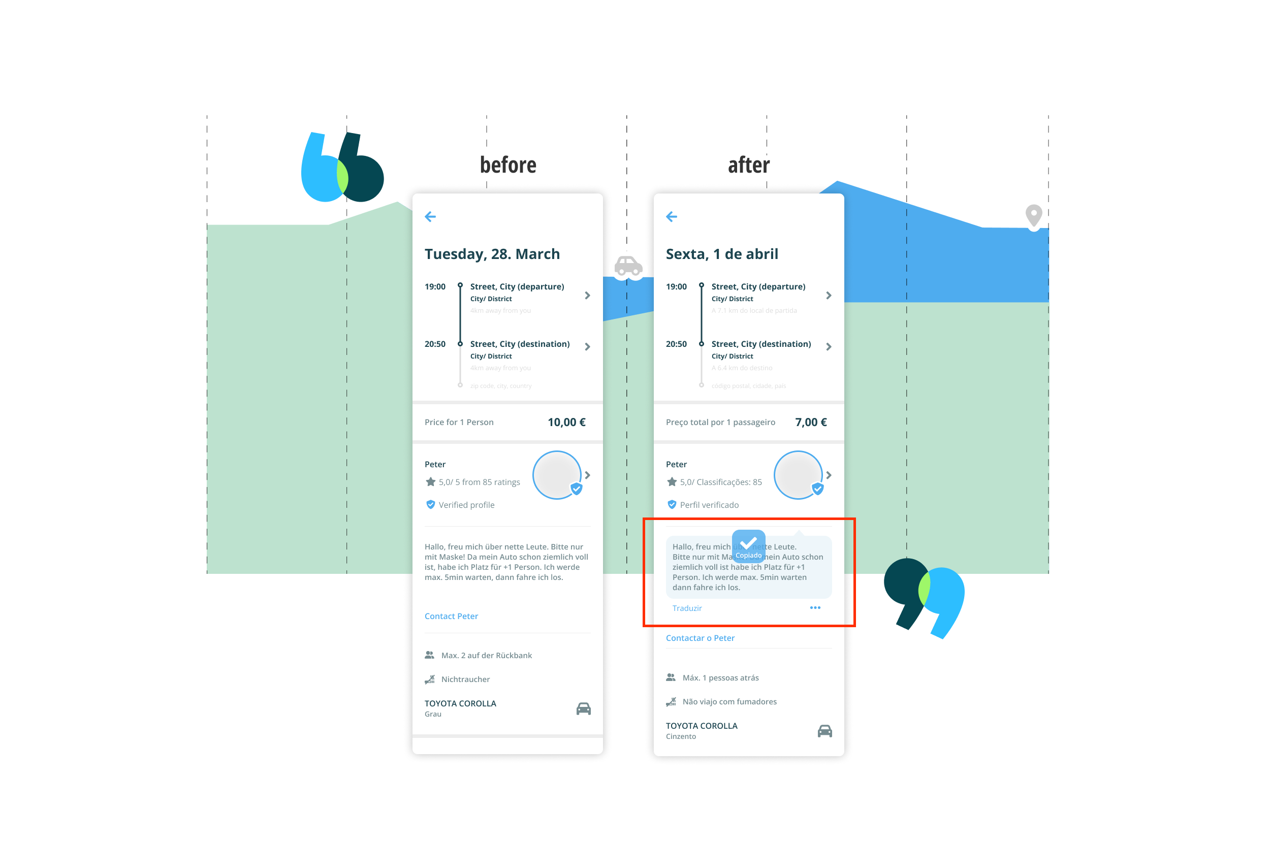
Fig. 1. The original view of the journey details page (BlaBlaCars version of April 2022 in iOS view).
Fig. 2. Prototype of the journey details page with new translation function
My first impulse was — how can it be, that a “global operating company” has problems with a language and its translation within their application?
I had 4 days to find out and offer an implementable solution.
Process & Approach
1. Research
To better understand the problem, I researched various sources. The result: There are around 3.1 million people living in Germany whose native language is not German and who cannot read and write German properly. Of these, 30.2% were between 18 and 35 years old (LEO study in 2018).
Fig. 3. Desktop Research
Who are the users?
Users who live in a country whose language is not their mother tongue and who rely on public transport. Therefore, I focused my research on 25-35 year olds (the average age of BlablaCar users) whose mother tongue —in my case— is not German.
Important questions
1.) What are the solutions for the users and for the company?
2.) What are the success criteria to measure the results?
3.) What are my questions to the audience by leading the interviews?
Initially, I was worried about developing a function that would work neither for the user nor for the company. So I sat down with my (inner) team and explored all the possibilities. I decided to use a Lean UX Canvas, which is actually intended to work with different departments within a company (Lean UX approach).
Fig. 4. Lean-UX Canvas
2. Empathize
To observe the users' behaviour directly, I started an contextual interview with the focus group, ideally BlablaCar users/ customers. And in case they didn't know the app yet, I wanted to show them the current user interface directly on my smartphone.
What’s your phone’s language setting?
So I conducted interviews with 5 people from a network who are expats living in Germany and don't speak German at all. I wanted to know exactly a.) what language setting they have in their phone, b.) if they have a workaround to solve the translation problem, and c.) why the descriptive text is so important when all the basic data about a trip (departure, price, number of persons etc.) can already be read in the app's system.
Fig. 5. Affinity Map
My survey showed that most users would translate the description text manually with a translation tool. Furthermore, I could rule out with confidence that a global language setting for the entire mobile application (within the app) would solve the problem. Because 100% of my focus users surveyed already use their phone and thus the BlaBlaCar app in their native language or in English, and yet the user description text cannot be translated.
If you use a workaround, which one?

3. Define
-
If passengers cannot read the driver profile and journey description for an upcoming trip, they lose confidence in the driver and a smooth journey. This also reduces the chances of an active booking and or quick processing of the confirmation by the Driver.
-
Fewer misunderstandings between the parties (driver & passengers), thus fewer cancelled trips and better communication in advance.
-
Fewer live chat requests between passenger and driver. Less support for cancellations of booked journeys. Better ratings between driver and passenger.
Assumption
It can be assumed that a translation function in the app will lead to fewer frustration between the parties, thus less cancelled trips and or chat communication in advance. This can make a difference for trips planned short term and booked via the mobile application in metropolitan regions.

Fig. 6. Storyboard scenario 1 & 2

Fig. 7. User/ Customer Journey in six stages
One persona has emerged that has folowed thing in common with the entire focus group. They are all multilingual, mostly English and their mother tongue, confident in using translation programmes such as Google translate or deepl, and flexible in dealing with different private and public travel providers and also live a very eco-consciously life.

4. Ideate
Actually, I use such rough sketches mainly to test ideas on paper or to stimulate discussions in the team. But with users I could discuss also several options of my concept ideas and observe were a user would instinctively press to solve the “translate” problem. I'm not sure if this works equally well for testers with different backgrounds and technical affinities.
Fig. 8. Low-Fidelity Prototypes
Fig. 9. User Flow Chart (current)
5. Prototyping
The idea is that the translation is done in the language a user has already set on their phone, in my example Português. And I wanted to check the user reaction through a prepared split test.
-
By text link
The version with a simple translation label under the user description, a reset to original, and the source about which technique was used to translate.
Fig. 10. Translating with simple text-link
-
Via the "Copy" button
The general consensus was that if the app obviously can't translate it, I'll do it myself. So in this version, a simple icon button copies the text to the clipboard.
Fig. 11. Translate via workaround copy button
-
Via select menu
Here, the user has the choice between translation via copy to a third party or directly in the app, with information about which language has been translated automatically.
Fig. 12. Translating via select menu
It was very enlightening to be present during the user testing. It turned out that users almost instinctively wanted to copy the entire text by double-clicking it in order to translate it themselves with a small workaround because they expected native text control, as is familiar from digital text editing.
6. Testing
Most practical solution
After a initial round of feedback, I was able to further simplify the solution. Unfortunately, there is currently no 100% guarantee that a translation will always be correct. This is because dialect and nested grammatical forms, especially in German, are a major challenge even for AI control. From the user's point of view, the translation can also be done by a third-party provider. And I'm sure there is also an API for business solutions available.
Minimum requirement
A friendly reminder at the bottom of an input field for the profile and the travel description in the editor view could help to empathise with passengers. It doesn't solve our problem entirely, but a hint that there are travellers for whom German is a foreign language could be helpful in urban areas.
-
The documentation of feedback facilitates data-based evaluation and thus enables improvements.
A defined A/B test strategy enables targeted execution of the tests and therefore better results.
Clarifying technical issues contributes to a common understanding and efficient collaboration.
-
Usability tests with different user groups to obtain relevant and meaningful data.
Develop a RollOut strategy in a live test environment in order to measure the success on real data.